Ooh & aah
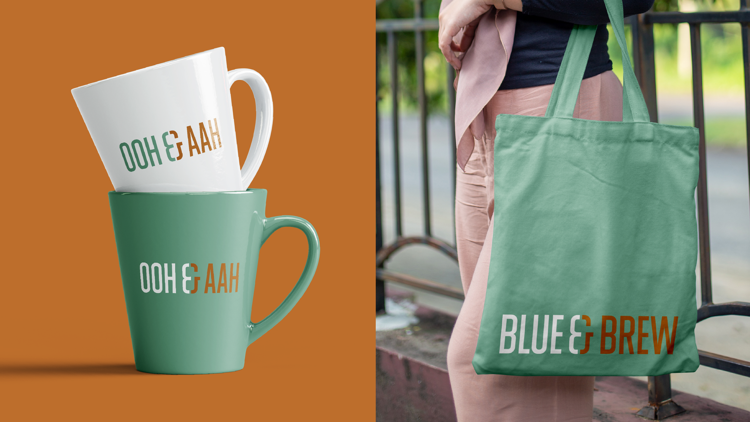
Blue & Brew is the University of Cambridge Sports Centre café. It’s a clever and distinctive name, and the café’s logo needed to make the most of its alliteration and rhyme. ‘Blue’ is a reference to Cambridge Blue. Not many organisations can claim ownership of a colour, but Cambridge Blue is world-famous. It’s been Cambridge University Boat Club’s principal colour since 1934 and is seen by more than 100 million people who watch the iconic Boat Race every year. Blue & Brew’s logo was influenced by condensed typefaces commonly associated with sporting events and the stencil typefaces on sacks of coffee. The connection and flow between the two words is accentuated by the way their colours come together inside the stencil-styled ampersand. Blue & Brew’s identity includes a library of ‘word partnerships’ which echo the design of the café’s logo.



It looks fantastic. Thanks for all your work.
Ashley Edwards Marketing and Communications Manager
